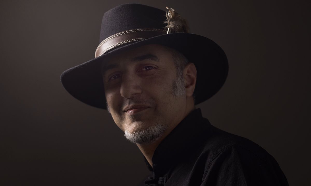
Graphic artist, Edik Boghosian is from a revolutionary generation, but in his case, the Iranian revolution.
He was born and raised in Tehran, he moved to Armenia bringing with him a lush layer of Iranian cultural, the experience of resistance, and an aspiration to be minimalistic.
In his works (comics, illustrations, theatrical posters, logotypes, portraits, graphics) the style of laconism “less talk,” is a trick that helps the viewer to focus on the content.
It’s like we need to lock the hole in the world so that your view is wider.
Edik Boghosian cooperates with an Iranian satirical magazine, and has also worked with Armenian mass media.
“I was also ready to work for free, because I wanted accumulated thoughts to come out in the form of images. Plus I would often participate in editorial cartoon festivals, presenting my works while representing the media as well,” he says.
Edik Boghosian considers language, fonts and their combinations to be an inseparable part of design. In a broader sense, The Designer’s Diary was an experiment, a book of Iranian poetry translated into Armenian, and a product of his own style.
“I tried to convey the melodies and flowing sounds of Iranian poetry in the form of images,” he says.
According to him, the phases and course of the Take A Step movement are worth studying from a design perspective.
The Velvet Revolution also succeeded with the help of imaginative messages and calls. How important is the formation of movements, the framing?
In general, design is the development of the concept and content. Many people understand design as a visual component, but design is everything, our decisions, our choices, as well as things we rule out and reject, aspirations. That is, a compilation of content.
Design and the Take A Step movement were interconnected.
I don’t know if it was done consciously or subconsciously, but in any case the idea of walking was imaginative and attractive. It was even reminiscent of the idea of running in the film Forrest Gump, of course, ignoring the physio-psychological problems of the main hero.
I think it started with the precedent made with Raffi Hovhannisyan’s Hello campaign, which brought a culture of face-to-face dialogues, creating contacts and greeting each other, which despite having excited the people, didn’t localize in Armenia. Perhaps the reason was Raffi’s age, or being a Diasporan Armenian (I am also a Diasporan Armenian, and I know how much the pathos gets in the way).
Nikol Pashinyan made the idea of walking more interesting. He walked from one point to another, he created an environment of camping, during which changes were seen; external, clothing, (after a few dirty shirts he was mocked at the National Assembly), and the number of people walking increased.
Later, the characters of these walking and changing people brought success to the movement.
Overall, Nikol appeared in Yerevan, in the right place, at the right time. It’s interesting that the element of art also worked in Rodin Square. The samples of classical art, sculpture, appeared at the starting point of the political movement.
Perhaps there was a desire to step away from memoirs onto a free, fresh space.
Of course, there was an issue of creating new symbols. The movement needed to have its design, including linguistic.
We saw that in the first few days the word “occupy” was used. They announced that they were going to occupy an area, for example, a radio building. That especially encouraged the young people, who didn’t think that it was at all possible to consider the fulfillment of their responsibilities as a criminal offense. Then, fortunately, the occupation was no longer relevant.
I moved to Yerevan in late 2007, and when I witnessed the events of March 1, I compared them to the Iranian revolution. On the eve of March 1, there was an atmosphere full of provocation and aggression, which was quite scary.
Now, when Nikol didn’t do anything, he was simply walking, it really changed the situation (perhaps he had taken the experiences from March 1 into consideration) and the movement acquired the characteristic of a network.
The people realized that any struggle and change was not being done for the sake of a specific person, but for themselves.
I think that the change of power took place on April 22, when the movement leaders were captured, and the people began to voluntarily take to the streets and the number of participants doubled at once.
The movement placed importance on each individual, it changed the symbolism and made it into a network. People felt their “I” in themselves instead of in “others.”
They began to think, who cares if we do not have a leader, we need to act. Now or never. That is what created the revolution.
From the perspective of design, it’s also interesting that during the first few days, a wooden, improvised stage was used in the square, which was assembled right in front of the eyes of the demonstrators, it was very harmonious with the partisan movement.
After Serzh Sargsyan announced his resignation, a new stage appeared as a symbol of position and strength. That was also an element of the movement’s design, since before then, that stage was only assembled for the Republican Party.
The Take A Step team changed the visual code, showing that a stage is not only for large public events and for concerts organize by the Republican party, but also for them. That was a really well thought out symbol.
Nikol Pashinyan did not hesitate to utilize his broken voice as a “tool” that could reach a shout, then a croak and cough. That theatrical trick was very emotional.
I think that this movement was the most creative (designy) movement in the history of Armenia. More accurately, full of design.
It also woke up the sleeping online designer in everyone. Posters, slogans and songs were proof of that.
It’s interesting that the hashtag, an element of the virtual space, entered verbal speech. I can’t say how that transformation took pace, but during the movement, all of us started speaking in hashtags.
Take A Step, Reject Serzh was a classical rhyming text and also a musical structure, but worked as a hashtag language, which, as it is said in kindergartens, is easy to memorize.
It seems to me that the #MyStep hashtag was much more successful, than for example, the #dukhov hashtag which was used in the future, whose design was better than the word.
In any case, the design needs to have a substantial foundation. It’s interesting that #dukhov received a completely different context, than it was originally intended, and the movement participants and the designers worked well together.
Of course, the people need to be spoken to in the people’s language. I think that on a linguistic level that worked very well. It’s simply a pity that the My Step logo design wasn’t successful.
Why?
Perhaps for the very reason that almost no one remembers it. The logo simply was a visual translation of the text. Aside from that, it had the wrong emphasis. The footprint was placed right on the words My Step, as though someone is stomping on our own idea.
Taking into consideration that in order to take a step we need to look forward and not at our own steps. In reality, the goal should be to emphasize taking a step forward.
I think that the logo was the movement’s weakest link. Meanwhile, the step was the new symbol, which began to be used by everyone, including in advertisements. For example, by saying take a step, write in Armenian letters; take a step, buy this or that product… That is to say, it has a goal be an incentive.
That also was reflected in a series of individual’s posters, the words and meanings played. The revolution was also documented with graphic design.
I think that all designers who can be active and creative, have been quiet and restrained, and these days created an outburst, a creative spark. Design began to boil over.
I decided to create printouts, but instead of a message of rejection, I decided on something more positive, Mer Zhir Azg (Our Cheerful Nation). It’s interesting that when people come to live in Armenia from abroad, you see that people in Armenia are working, rather they are doing work. That is, doing work, going to work is like a ritual, where nothing that you do is important, the important thing is that you are doing something.
Compared to Iran, the rhythm here is very slow, and aside from that, less productive. Maybe I sound a bit rude, but the percentage of actual work being done with tradition of doing work at a slow pace is low.
Our nation is diligent and the Take A Step movement helped to see the result of our personal small work. At least, by closing the street…
The post-revolutionary period seems less encouraging.
I think that everything is being done with the inertia of that excitement.
The leaders of the movement were able to use the internet culture well. On the whole, the huge capitalist advertising giant worked very well.
Activist of the movement, in using the capitalist advertising machine correctly, accumulated large capital – the trust of the vast majority of the people. They are still moving forward thanks to that force.
Almost all the participants of the movement are inexperienced, they can make mistakes (for example, not know the rituals of where and how to stand in meetings), but that inexperience doesn’t get in their way, since they have a strong capital of trust that I think will last for at least one year.
Until they get used to it and gather strength.
Interview by Nune Hakhverdyan
