I don’t watch television often. Recently, however, a short reportage broadcast on Public Television regarding the socio-economic situation in Armenia between 2007-2017 caught my attention.
Let me say at once, that the charts and texts were well put together. But the charts reflected on only positive developments. For example, the report I watched presented how many times the number of loans and deposits increased, how the loan-GDP ratio increased, how the loan interest rates have decreased and so on, during the period of 2007-2017.
Then I came to find that this wasn’t the only video of its kind. There have been several different short reportages within this “campaign,” of which one of them spoke about the developments in the water supply sector, the other, impressive indicators in foreign trade, the third about energy systems, etc.
In short, they want to show us that 2007-2017 have been years of only achievements (no mentions are made about bad indicators). In fact, it’s not clear as to who wants to present everything to us in this light, the television company, or those responsible for the economic bloc? The reportage makes no mention of who the client is, or who supported the making of these charts. However, it is obvious that the this propaganda is not coincidentally taking place during a time of political change, with the appointment of the prime minister just a few days earlier.
And are the numbers and charts really convincing? As I said, they are put together really well, so one can assume that specialists from the economic bloc in state structures were somehow involved. However, being good doesn’t necessarily mean being convincing or being sincere.
What are these charts about?
In general, most macroeconomic indicators are such, that they can be interpreted exactly as is convenient. For example, the sharp fall in the construction industry was interpreted as a recovery in the economic structure (a reduction in dependency on construction). Or when the rate of imported goods increased at a ridiculous pace, they say that it is a reflection of growth in the purchasing power of the population.
It is either possible to only “partially” speak about an indicator, without presenting the other side. Or it’s possible to simply keep silent about the context of how the improvements are taking place.
Finally, it’s possible to completely “forget” about creating charts based on key indicators, if the indicators are not good.
The opposite side of the socio-economic situation from 2007-2017
On one hand, we will try to present the “truth” behind specific reportages, on the other hand we will remind you of the forgotten indicators, again using charts.
One of the broadcasted reportages presented a comparison with the last 10 years of the export of goods and services from Armenia. From there it shows, that the export volume has doubled.
And what would the chart have looked like, if there was a desire to present a complete picture of foreign trade? It’s true, aside from export, import and trade deficit (Balance of Trade or BOT) ought to be presented as well. In that case, it will be seen that import has also grown dramatically, that is to say, money has always left Armenia much more than it has entered.
It will also show that the trade deficit (rift) has been getting larger with time. That rift had decreased dramatically only in 2015, and not due to the increase in exports, but as a result of a sharp decline in imports.
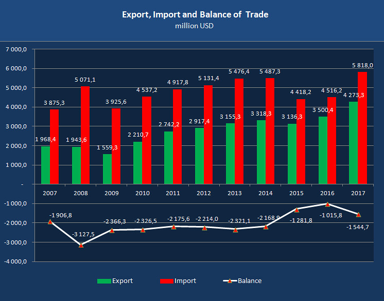
To be more sincere, it should also not that for example, the dramatic increase in 2017 of import and export volumes was largely due to re-export. In other words, the goods come to Armenia from a third country, undergo customs clearance, then, at this point as an Armenian export, gets distributed to the Eurasian market. Indicators improve, however it doesn’t have anything to do with our economy and the welfare of the population. That is to say, it’s impossible to convince the population that everything is fine using these numbers.
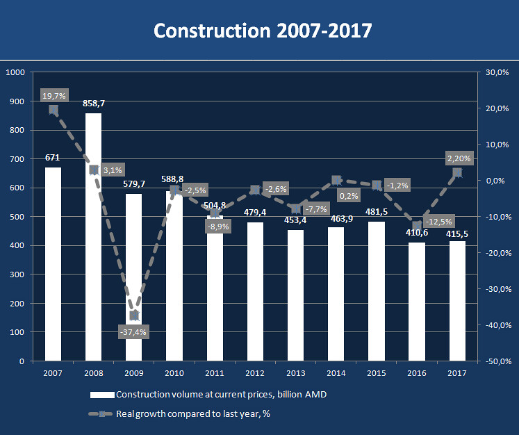
Perhaps I am mistaken, however I highly doubt that there is a separate report regarding construction, or that construction indicators are mentioned in the context of other macroeconomic indicators. Construction is among the list of the “forgotten.”
Why? Because the indicators are quite sad. Between the years 2007-2017, over the course of 11 years, we did not experience a decline in only 4 of them (of those four, 2014 experienced almost 0 growth, 0.2%). The volume of construction in 2017 at current prices is two times less than the levels in the pre-crisis year of 2008.
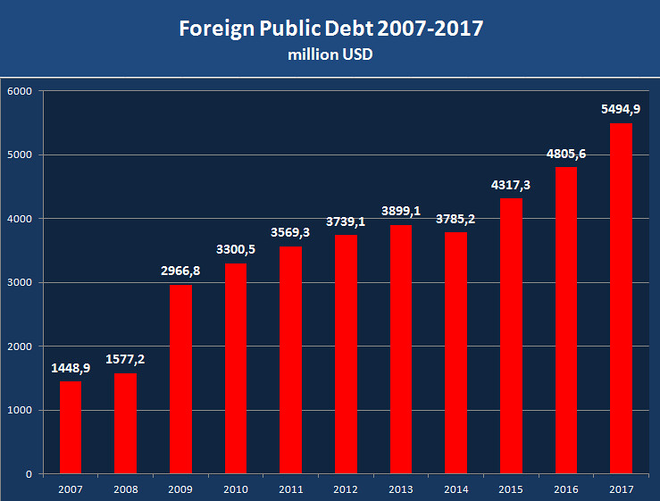
I also, for example, highly suspect that one of the most important indicators, foreign state debt, has been addressed within the framework of this “campaign.” And of course, who should remember that during the period between 2007-2017 alone, state debt had grown almost 4 times, from 1.45 billion dollars reaching approximately 5.5 billion dollars. And if we add this to internal debt in line with total public debt, yearly increased interest payments and the use of a few billion in debt for “efficiency,” the picture would be complete and, naturally, easier to forget.
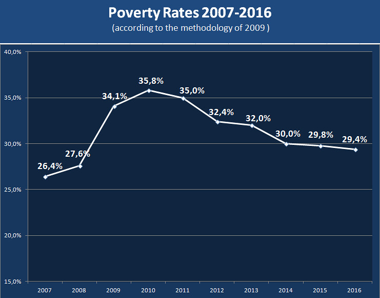
These are not, however, the most depressing indicators. On television broadcasts we have also forgotten to present, for example, data on poverty and unemployment rates.
Since it is difficult to explain, how it turns out, that according to the charts that make us happy, whereby the economy has been restored, lending has increased not by percentages but by a few times, foreign trade has increased, the budget revenues and expenditures have increased, but the poverty rate was higher in 2016 (29.4%) than in 2007 (26.4%).
The same can be said for unemployment. In 2017, the unemployment rate was 17.8%, higher than it was in 2008 (16.4%). For the sake of fairness, let us note that in 2007, the unemployment rate was higher, 28.7%. However, starting 2008, the unemployment rate is not comparable with the previous years (due to differences in the methodology).
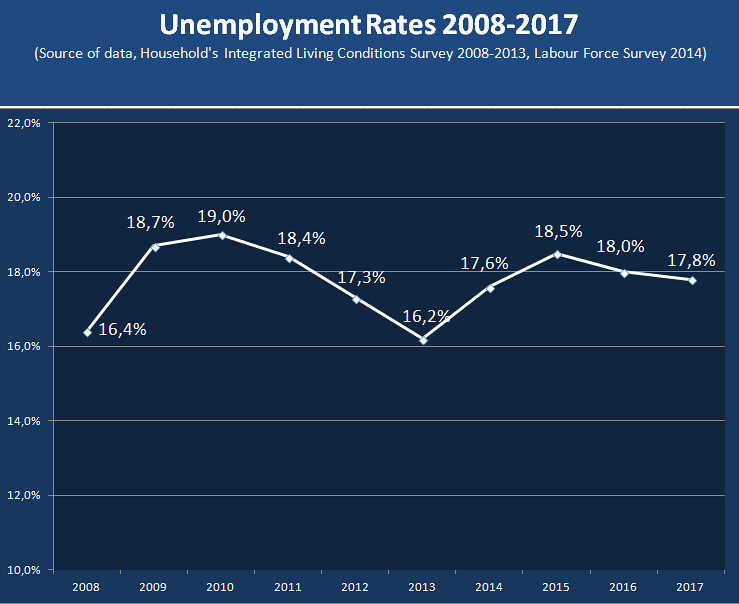
We can continue the list of “forgotten” indicators, creating charts regarding income inequality, the number of children attending school, the number of crimes, and so on. However, we think, this is enough to picture the one-sidedness of the reportage regarding the social-economic situation in the period of 2007-2017.
Whom are the charts for?
But the following question is more interesting: which audience are these infographics for? For example, what is the point of showing the dynamics of the loan-GDP ratio on public television, if a large part of the population doesn’t know what a GDP is, moreover the loan-GDP ratio. Or what is the point of talking about the export of goods and services, if few people know what “export of services” means.
Similar reportages can “work” in countries where the society has enough financial and economic literacy. And it’s impossible to lie to people who are literate in finances with similarly filtered charts. So really, the purpose of this reportage series can never be understood.
Instead, it would have been much better, understandable and welcomed if training programs were broadcast nationwide, which would, using reasonable language, explain to the people what GDP is, what state debt is, what a budget is, how it is generated, what actual interest rates are etc. However, private channels do not do that, because they believe that the audience will be small and accordingly, the amount of money coming from sponsors and advertisers would be less. It is more profitable to shoot and air series, which is precisely what is being done.
Babken Tunyan


