Because of my job, I follow the charts and graphs used by the media, and I’ve noticed that journalists sometimes use manipulative graphs. I’ve identified some examples where the approaches that were taken were incorrect.
Comparing the incomparable
A comparison of two different types of economic variables with different dimensions can be found in the graphs and charts that accompany news stories. In fact, there is no connection between two two comparisons.
The author, comparing data that has nothing to do with each other, seemingly implores consumers to find meaning within them and rationalize what they’ve seen.
For example, on one axis you can see the product volume; on the other axis, the dollar amount. They have different dimensions; it’s possible that they increase or decrease together, but they have nothing to do with each other. And the existence of a cause-and-effect relationship between comparisons is a mandatory condition.

The divorce rate and the per capita consumption of margarine are compared in the graph below. A visual comparison exists, but there is no real cause-and-effect relationship.
Comparison of absolute numbers is problematic
In graphs, manipulation is mainly done when comparing absolute numbers.
For example, immigration is observed 20 years ago and now, to demonstrate the declining rate. Here, it’s important for consumers to understand the context. In absolute numbers, the number of immigrants may have decreased, but in terms of percentage, increased. The issue is that the population number has also changed and showing the dynamics in percentages would paint a more accurate picture.
I’ve noticed news stories that claimed that after Armenia joined the Eurasian Economic Union, imports from Armenia to Russia dropped. But once again, the context isn’t taken into account. The issue is that Russia has reduced its entire volume of imports. To get the full picture, we must compare imports from Armenia to Russia with imports from other countries to Russia.
The lack of causal relationship in the graph may mislead the population and economic policymakers.
When the state manipulates numbers
They possess the main database and they can do this more easily. As long as there are no alternative data, they can show graphs that can’t elicit questions.
In Armenia, the main databases are the tax and statistical services. Alternative are the World Bank data, since they have criteria by which to improve them.
It would be better for journalists to work with different sources that are independent from each other, to increase the degree of objectivity.
How to distinguish manipulation
Data manipulation is a problem all over the world. Data can be combined in such a way to get the picture that the person producing the graph wants to get.

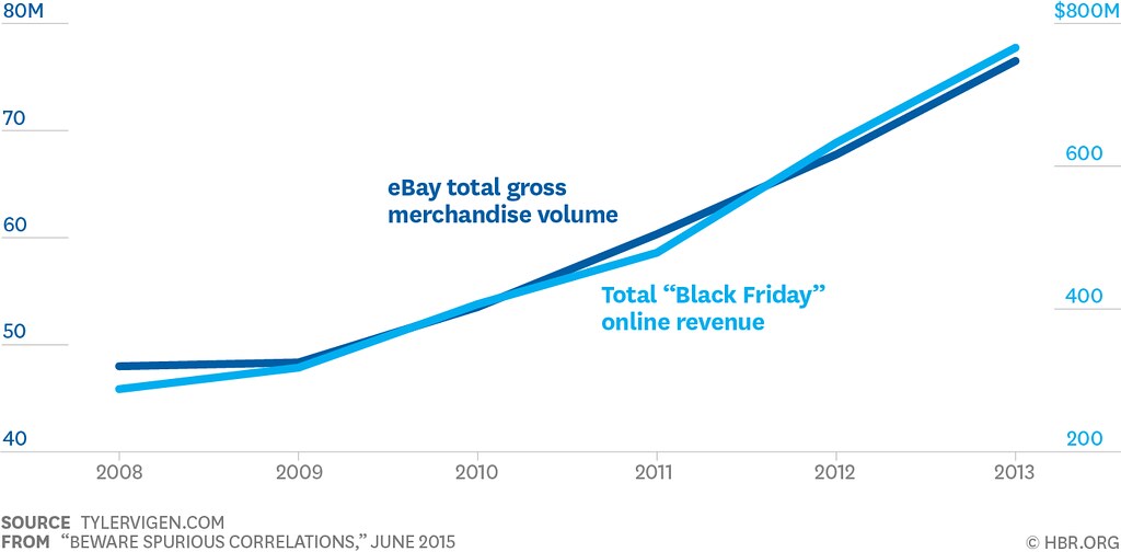
For example, in this graph, eBay’s total gross income is compared with Black Friday online revenue. These two values are different: comparing them is the same as comparing apples with oranges.

It would be better to create two separate graphs to present this data.
It’s important for consumers to distinguish sources and understand in what light a given media outlet is presenting a situation. Pay attention to the hyperlinks. A numerical picture that anyone with the links can reproduce from start to finish can be considered reliable. Consumers must recognize the author, his work, and trust him, even if he is not an economist by profession. In short, when people read news articles with graphs, media literacy becomes very important.
And the journalist needs basic economic knowledge; for example, if he is writing a story about pricing, he must have a command of pricing mechanisms.
It’s helpful to read at least the fundamentals of economics or lectures on some macro-economics trends (unemployment, inflation, economic growth, inflation, supply and demand, etc.).
To make journalists’ and editors’ job of creating graphs easier, I’ve isolated a few helpful resources:
Mikayel Tovmasyan
Economist


